- A Room On The Moon
- Posts
- Classic Neutrals? Not such a thing...
Classic Neutrals? Not such a thing...
The lines between the digital and physical are merging, and as a result, the colors consumers see on screen are translating directly into the products they buy. In this screen dictation colors are becoming more nuanced and uplifting with glimmer brights and after-dark neons. In this game neutrals are changing.
Victoria Diaz
April 09, 2024
A “fun fact” about neutrals:
Neutral palettes always look cute, calming, composed. Whenever you see a person wearing combined neutrals from head to toe first thing you think is: “they have their shit together” “They are emotionally mature, reliable people”. And yes, there’s some psychological moment there but the truth data reveals is that neutrals do not perform well regarding online sells. Neutrals tend to liquefy on screen and often become blind to the always-browsing eye so items of apparel, accessories, interior elements or packaging tend to perform worst in sales than bright or deeper colors. Don´t get me wrong to have neutrals in your collection or product range is very important as they prove to be time-tested.
So how do we redefine Neutrals?
Use these warm neutrals to humanise AI aesthetics.
Enhance neutrals with hypertextures, transpaencies and metallic finishes.
Take inspiration from neolithic neutrals and apply these colors to contemporary homewares made of textural stone, minerals, ceramic, glass, resin and metal.
The main tip I can share from IG & Shopify data is that if a product is in neutral then its form or texture has to be bold and only then this product will break the algorithm and catch the eye.

For interiors: use neutrals to deliver texture
The concept: not everything that looks soft feels soft: use both tactile and visual softness as a means to deliver intrigue and challenge perceptions. Research material finishes and treatments, and use rounded contours to strengthen the story.
Ones to watch: the work of Charlotte Kingsnorth is a key reference on how marshmallow softness can be achieved in pigmented ceramic, slip-cast from stitched foam. Rejo Studio infuses its designs with a digital cozy quality, emphasising the surreal softness of its pieces via finishes such as peach skin.

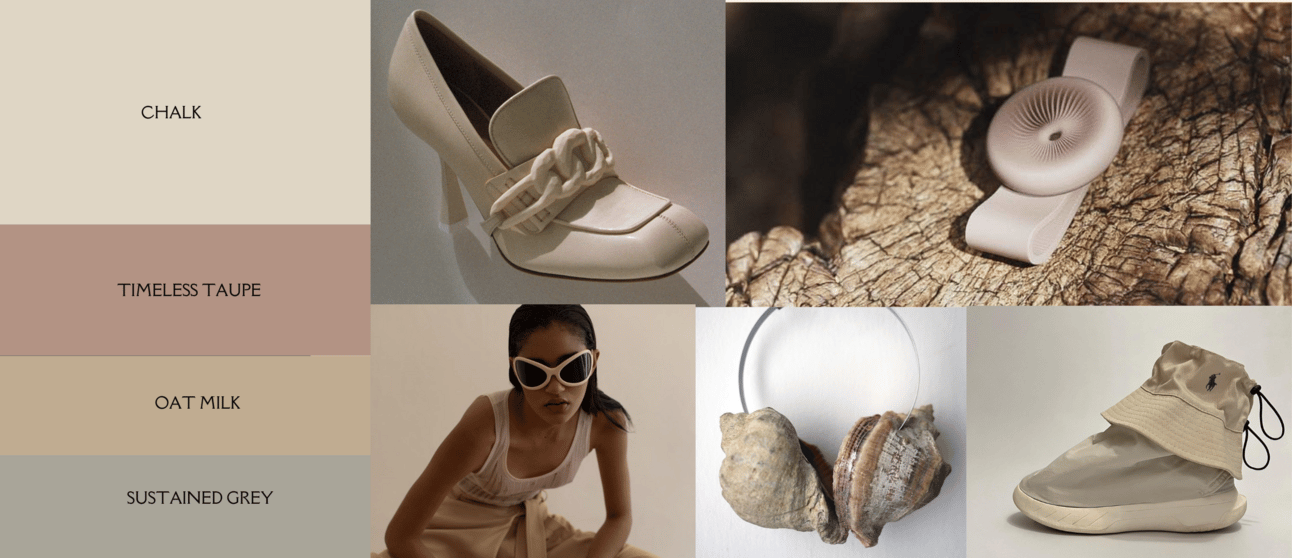
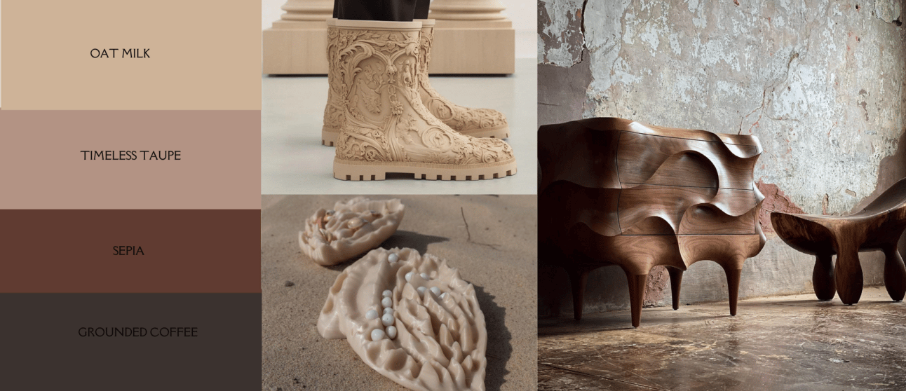
Warm up your neutrals:
How to use? Explore highs and lows of color, combining neutrals with sensorial dark Chocolate for contrast, and create glowing halo effects with Celestial Yellow and Peach Jelly combinations. Design with warming houses and bodies in your mind.
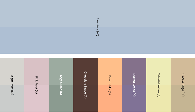
LT: long term color, A: annual color, S: seasonal color
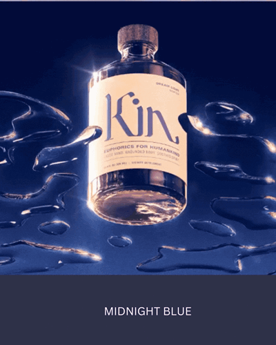
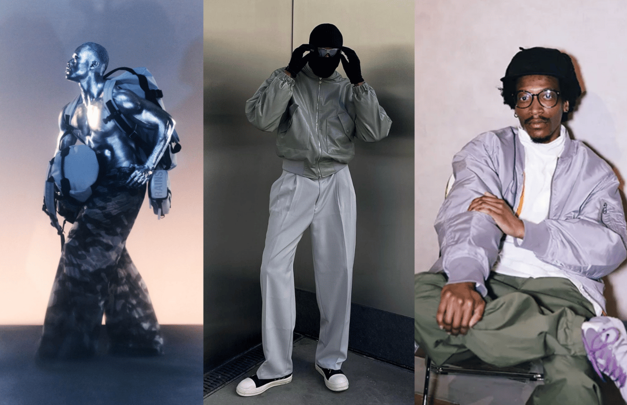
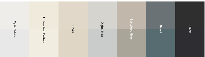
Add metallic to classic neutrals:
In this gray evolution through the seasons we see how this classic neutral moves towards a “warmification” and a “metallisation” of its identity

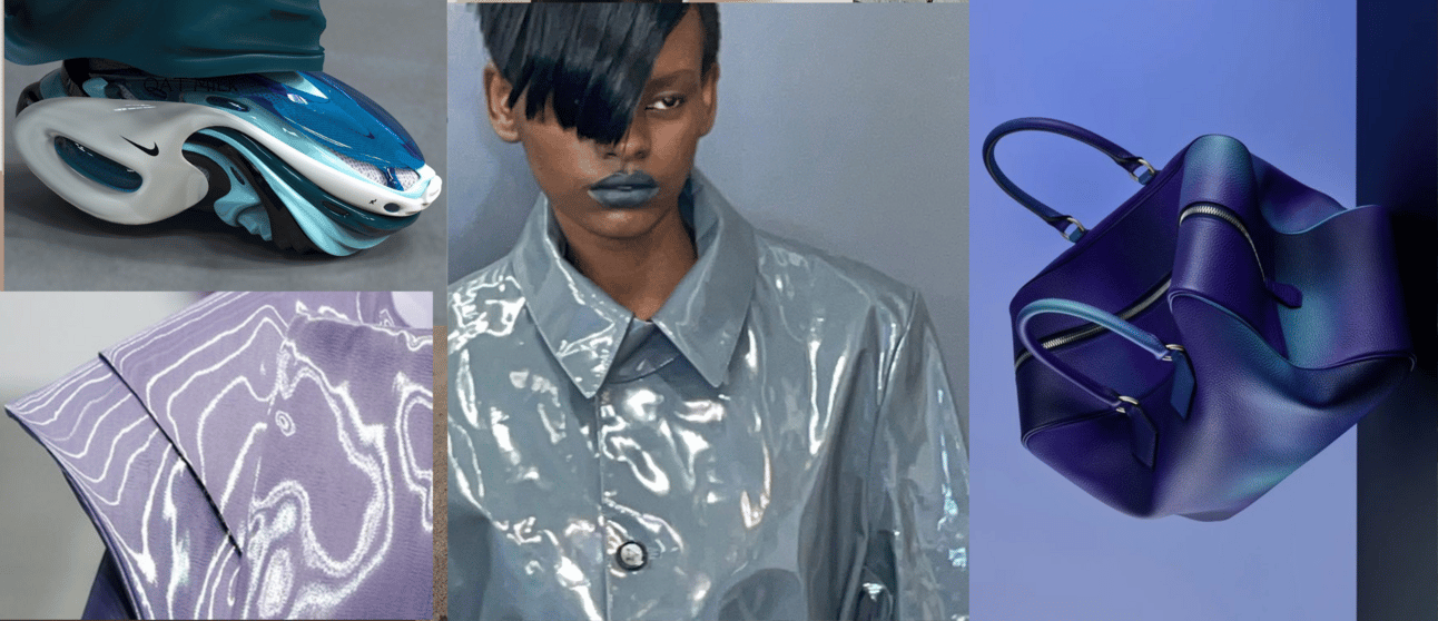
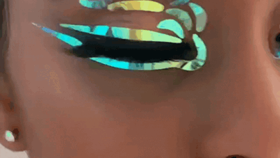
Add transparency to classic neutrals:
Pattern inspiration with neutrals:
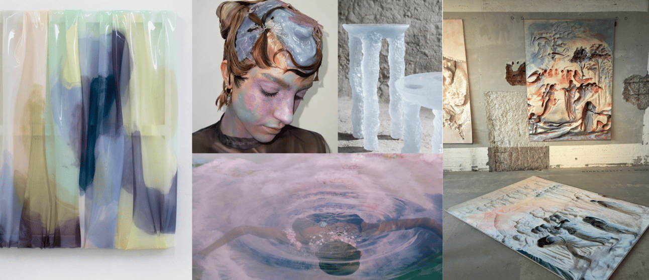
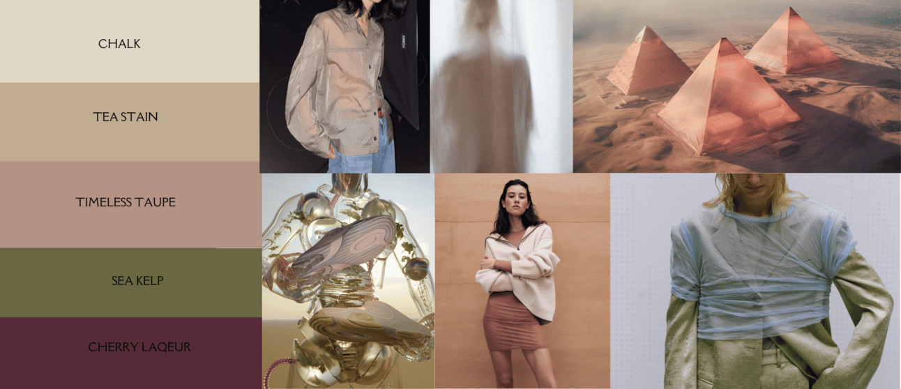
Fragile Lands
The concept: as consumers connect deeper with nature, highly detailed organic lines and complex Natures Textures will come relevant.
Design direction: as print remains a challenged area, this elevated direction will entice even the more minimal consumers. Make sediment layers your new stripe and fossil imprint your new conversational. Use as an alternative to animal print, focusing on nature’s skins.
Ones to watch: for interior collaborations and ornamental modernism, check out surface designers Kustaa Saksi and Freeling Waters.

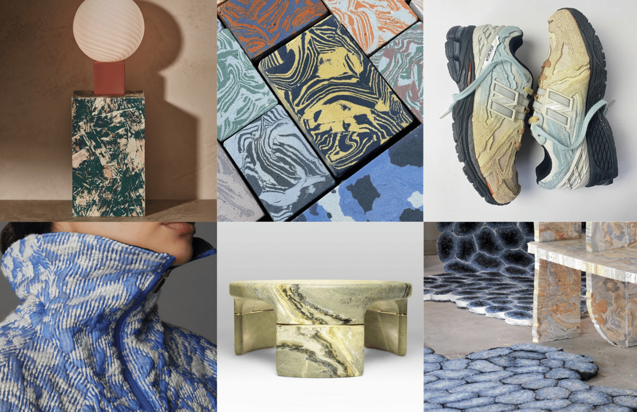
Calming Marbles
Balance neutrals and mid-tones for calming looks. Use waste for color mixes.
The ones to watch: balance neutrals and mid-tones for calming looks. I. In fashion, needle-punched camo jackets by Gaia Invernizzi brings marbling to life. UK brand Orla Lawn's oriented strand board Spelk offers new aesthetics, while Portuguese studio Tosco creatively swirls concrete into two-tone tiles and products. Transformed Remnants by Dutch designer Willem Zwiers includes "book material" furniture made of sanded-back, stacked and glued secondhand books; sawn-back carpets are made from reclaimed G-Star jeans.
Babes, I hope this content inspired you in some way or the other. Please let me know your comments and suggestions, I’d love to hear you up.
I’m working on some technical aspects so next newsletter I can deliver lil animated mood-boards.
Talking to you next Tuesday,
Love,
Victoria

Reply