- A Room On The Moon
- Posts
- 4 key colors for 2025
4 key colors for 2025
Energizing brights- 2025 five must-have shades that will resonate across all industries and boost consumers globally
Victoria Diaz
August 13, 2024
Can you even imagine what would be the color of energy itself if energy was an entity? Well, I invite you to open your imagination gates and play this game with me.

I present you 4 colors that will bring energy and renewed force among 2025 dark tones. Let’s start with pink. You know, Americans loooove pinks. And therefore media feels magnetized by pink shades for its connections with “sexualized” energies and “innocent” vibes.
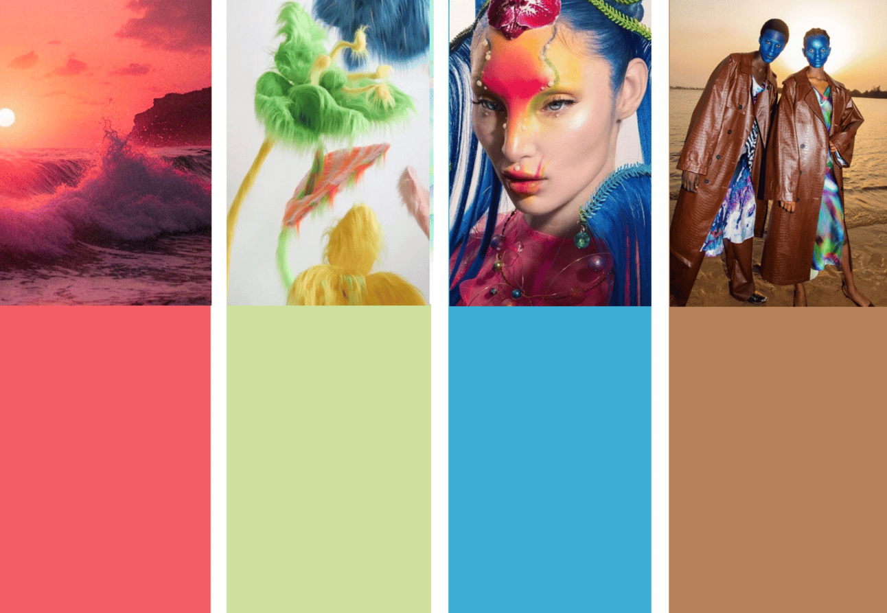
Sunset Coral:

Sunset Coral: 17-1647 TCX or 200 C
A key color for S/S 25 is Sunset Coral- a “feelgood” tone that appeals to the pursuit of joy. For the North America market it comes in a highly saturated color tat still remain relevant, but we see a change in this tone: it’s moving from the pink-based shade of Pink Cyclamen for S/S 24 to Sunset Coral towards 2025. This bright coral sits on the border between red and orange, and is also infused with pink, allowing it to feel familiar yet new. This is an intense shade that brings to mind sunsets and speaks to the growing importance of focusing on moments of pleasure.
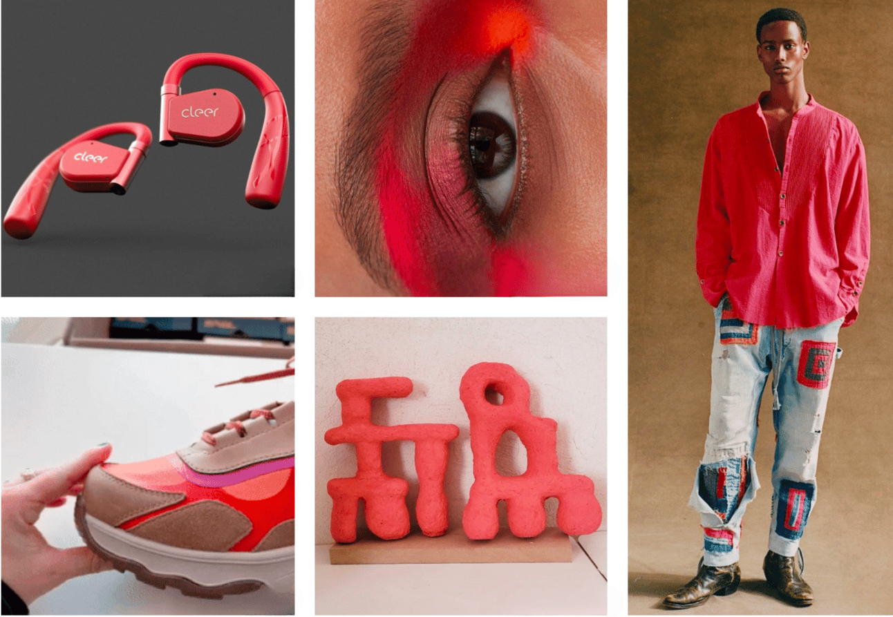
Clockwise: @cleersound, @moisesartnyc, @greglauren, @polinamiliou, @teva
Look how beautiful *Sunset Coral* looks contrasted with black for packaging:
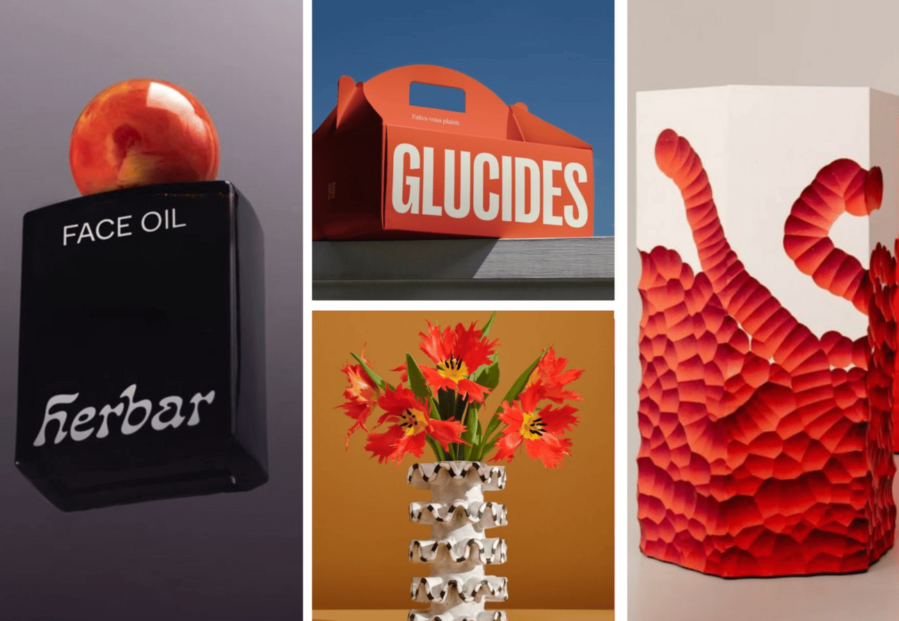
clockwise: herbar, Glucides by Solo, convenience store logo, flowers: unknown source.
Blue Lagoon:
Blue Lagoon: Pantone 16-4530 TCX & 299C
Update your palette with the hyper-bright shade of Blue Lagoon to drive newness and create seasonal impact. Use Blue Lagoon as a gender-inclusive shade across all fashion product categories. Donʼt be afraid to get playful with color combinations for this shade – think about using it alongside other statement brights or punchy tones:
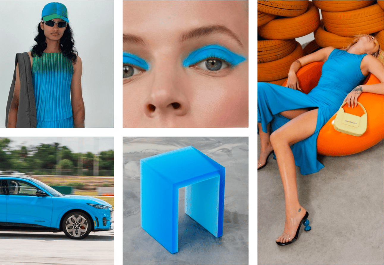
@arthurapparel, @adurasova, Simon Miller, Facture Studio, Ford
For packaging and industrial design it has a great marriage with intense red for an eye catching and nostalgic vibe:
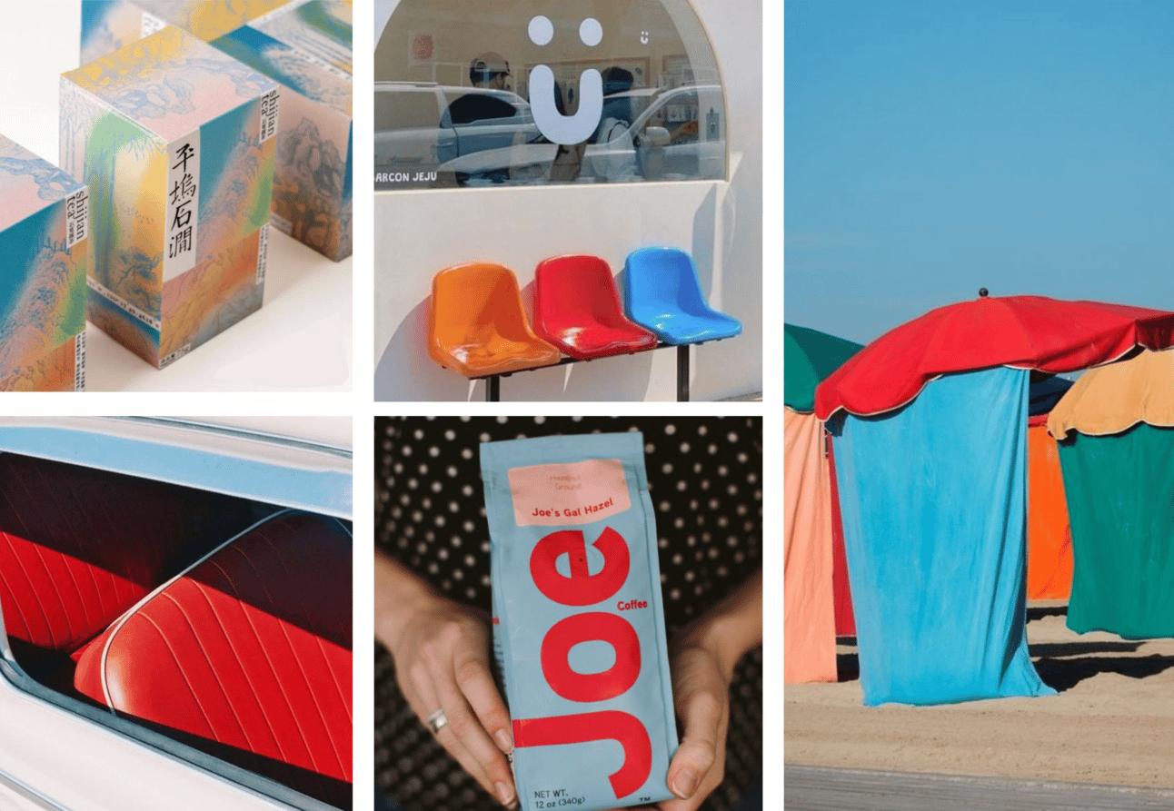
clockwise: c.c.Tong, User Paris, umbrella-unknowsource, Joe Coffee, my own photo.
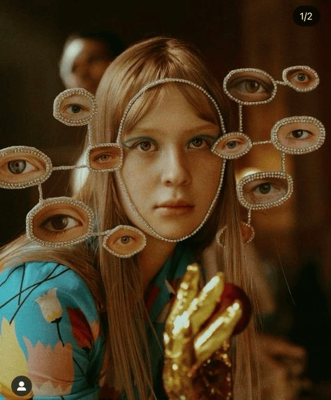
Cool Matcha:
Cool Matcha: Pantone 13-0319 or 2281 C
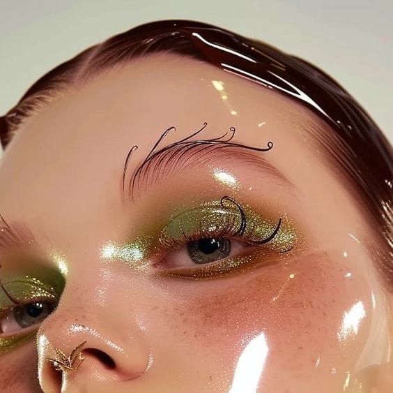
Tap into the ethereal quality of this shade to create a softer aesthetic for S/S 25. Use Cool Matcha as a gender-inclusive and transseasonal hue across all fashion product categories. For activewear and casualwear, this shade works perfectly when combined with other cool tones. Focus on the wellness attributes of this shade for beauty and interiors, using Cool Matcha to evoke a sense of tranquillity. Create an ethereal quality by applying this color to transparent and translucent materials to create a soer aesthetic for decorative accessories, lighting and consumer tech.

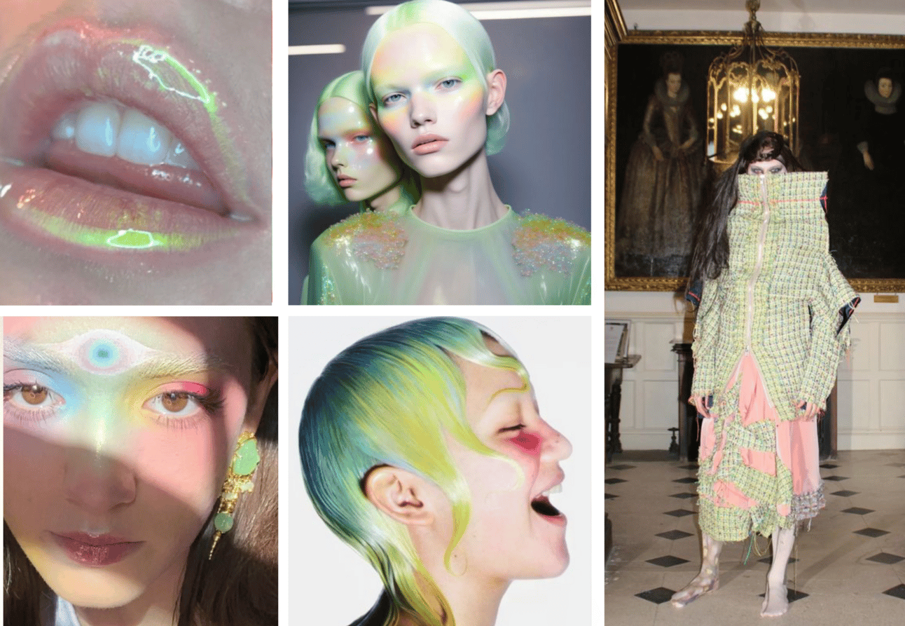
clockwise: @soft.geometry, Manir makeup, Rodarte, Sorel, Todd Patrick
For beauty this color has a unique future decadence quality making it a “must” beyond beauty editorials blending into “whatever” advertising with faces involved:
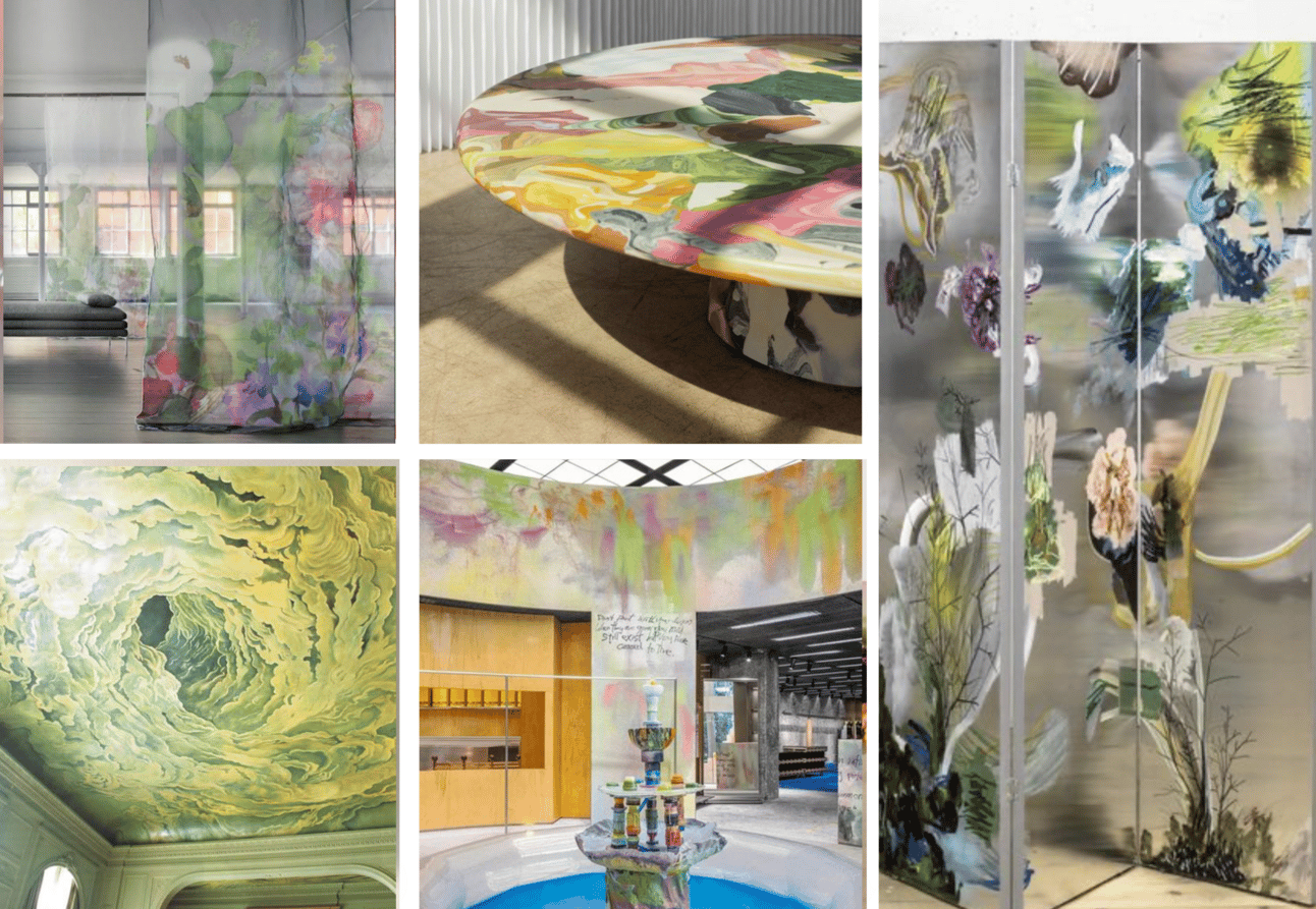
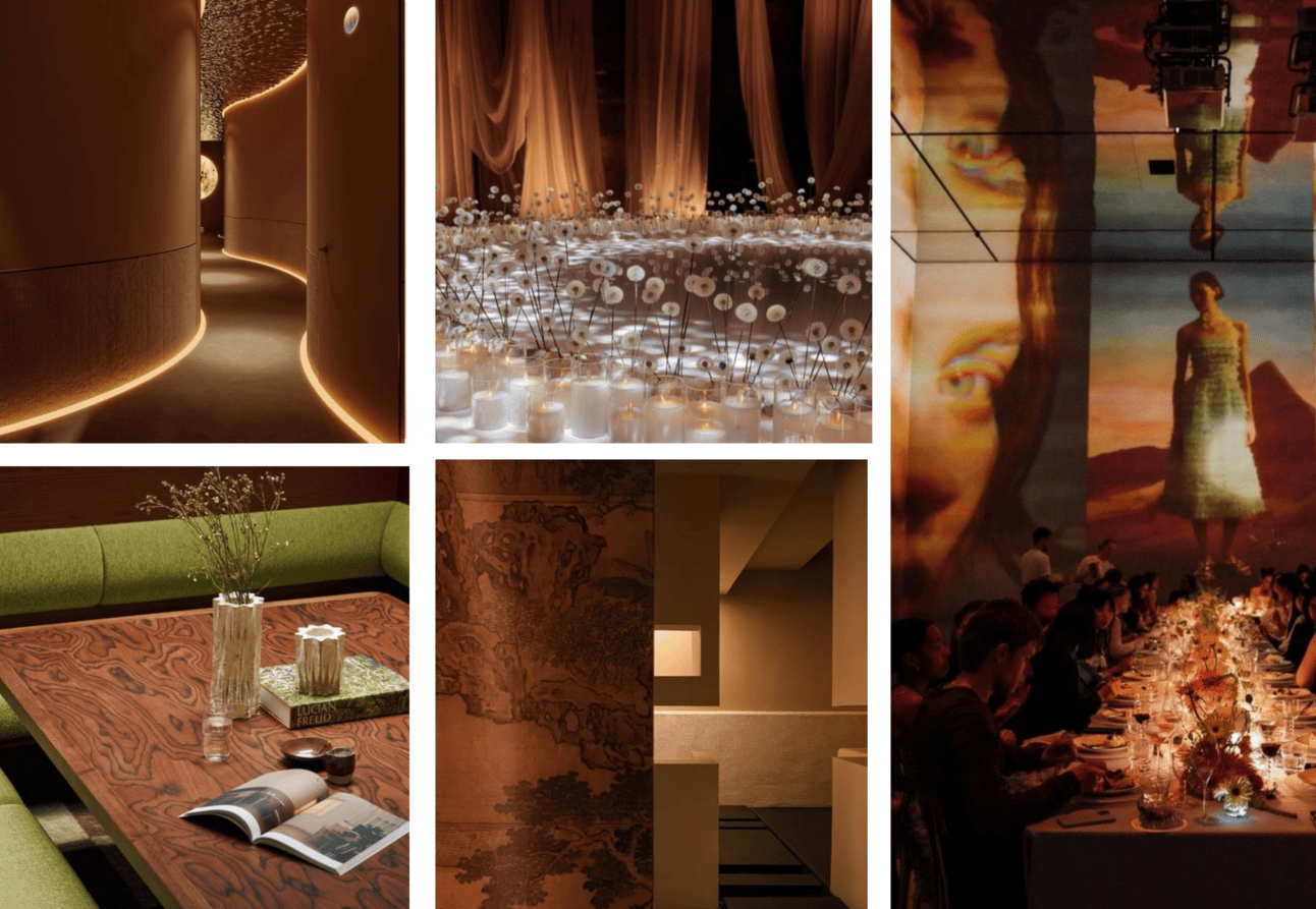
For interiors Cool Matcha also remains as a decadent tone bringing a complex mix of freshness and stressed vibes:
Sunbaked:
Sunbaked: Pantone 16-1336 TCX or 2317 C
Use Sunbaked as a grounding and versatile shade that can celebrate both refined and rustic aesthetics:

Clockwise: Alexis & Ginger, Kia, Gant, Ilia Beauty, Carhartt
For interiors and set design it brings a clash to future and past connectivity a sense of intimacy and introvert vibes:
These 4 colors will add oxygen and energy to your 2025 color palettes:
Sunset Coral, Cool Matcha, Blue lagoon and Sunbaked brown. Since 2025 color palettes are seen to be darker than before these colors have the properties to contrast well against deep tones. Consider applying them in unseen ways from beauty to set design.
Babe, hoping this “Big 4” enlightened your day and inspired the heck out of you. Please share with friends and make this newsletter your topic of conversation :-) because you know… to talk about design is way better that chat about cellebs :-)
Love,
Victoria

Reply